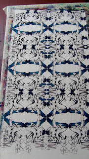
For C.I.
People come into your life for a reason. I am blessed to have had so many incredible people in my life serving as a wealth of inspiration. It is another layer to the thick cake. Everything I do is for the people I love and I am fortunate that that number grows daily.
This is a step by step of the image building process for this design. This is a 13 screen print.
 |
| A simple tile print. It begins as a medallion that is lined up on its axis. |
 |
| complexity comes from the additional pieces that are added and used as linking strips between the individual tiles |
 |
| The pattern begins to take form as a series of interlocking shapes that build an increasingly complex design. |
 |
These prints were challenging in as much there was an attempt not to make then vulgar or offensive. My idea was to produce an attractive print independent of its contextualized parts.
|
 |
| this first color is later covered by other printings and the layering tones it down. |
.
 |
| The tips and veins. |
 |
| The blue overlap only catches the interior of the print creating four diffrent distinct colors. |
 |
| A second ogival shape is colored with a darker shade to create more depth |
 |
| A nice lattice in the background makes a complimenting pattern. |
 |
| Inserts allow for colors to be modified within the body of the repeat. |
 |
| the gold insert also acts to move the eye back into the body of the design. |
 |
| The last fill color before the background is added. |
 |
| Black as a ground color makes the whole design pop and unified. |


No comments:
Post a Comment